Planning & Design Concept
1-1. Why did ersatz make a mask?
ersatz is a collective born of the very moment when, in the wake of COVID-19, the value of physical space began migrating into the virtual. It felt only natural, then, to make a piece of merchandise that could stand as an emblematic object of the pandemic era.
Throughout the pandemic we wore masks at all times, and the mask came to be more than a barrier against the virus—it settled in as a feature of the face, a way of expressing who we are. Amid the distancing of everyday life, we chose the mask as the medium that could speak for ersatz most eloquently, without a word.
1-2. Why a dental mask?
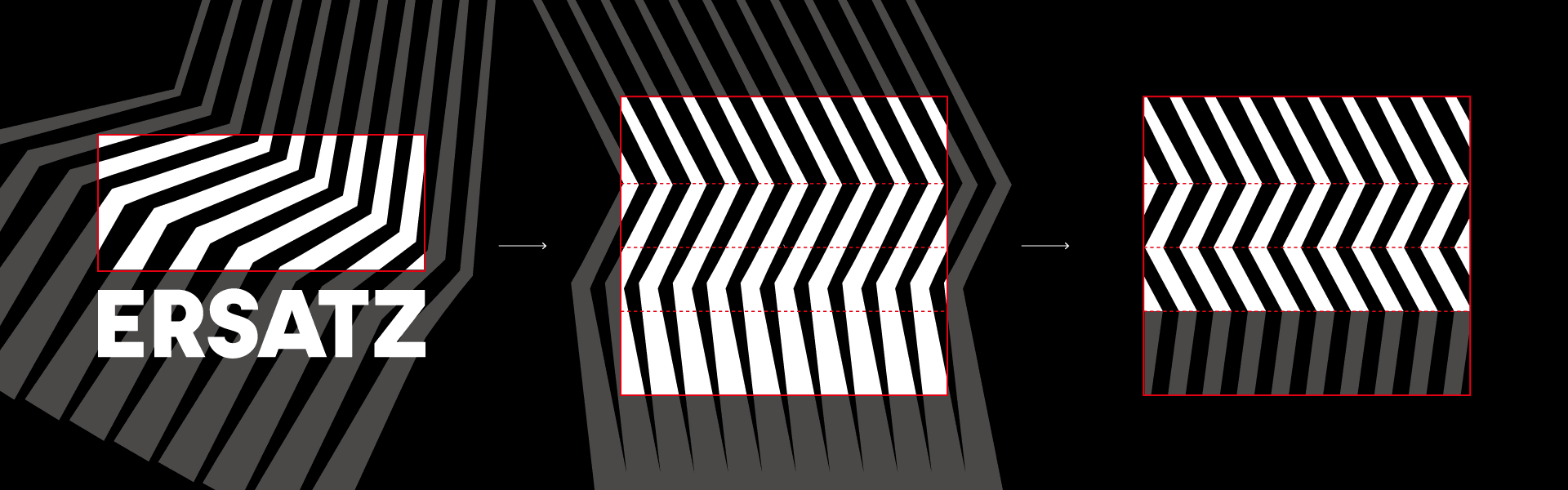
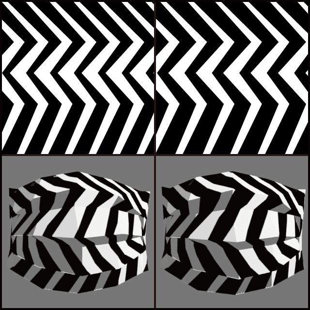
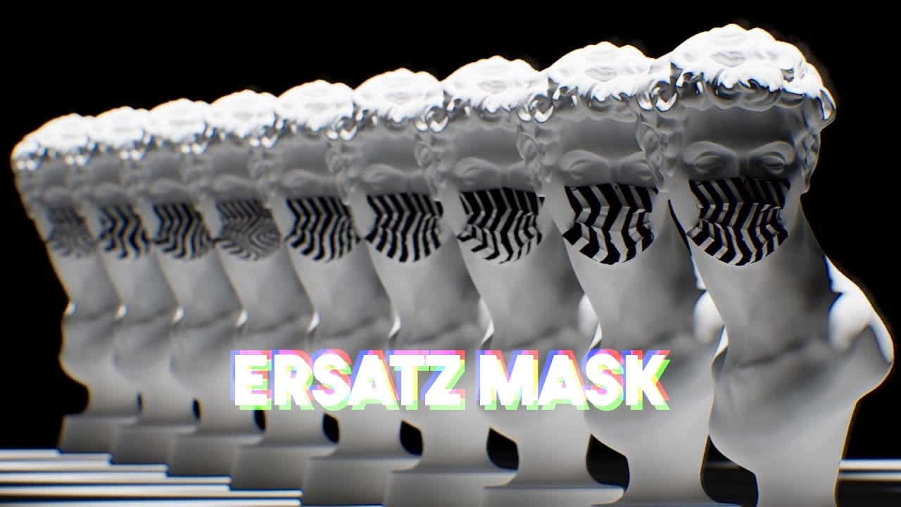
The ersatz logo uses black and white to evoke the digital binary of 1 and 0, and a folded line to suggest three-dimensional space—together symbolizing ersatz's identity as a studio that works with 3D virtual environments.
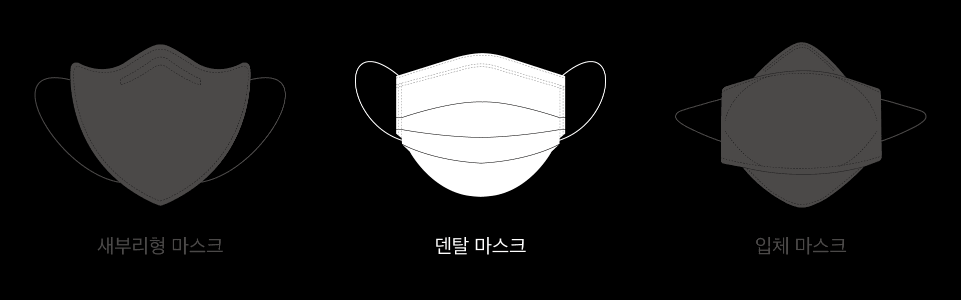
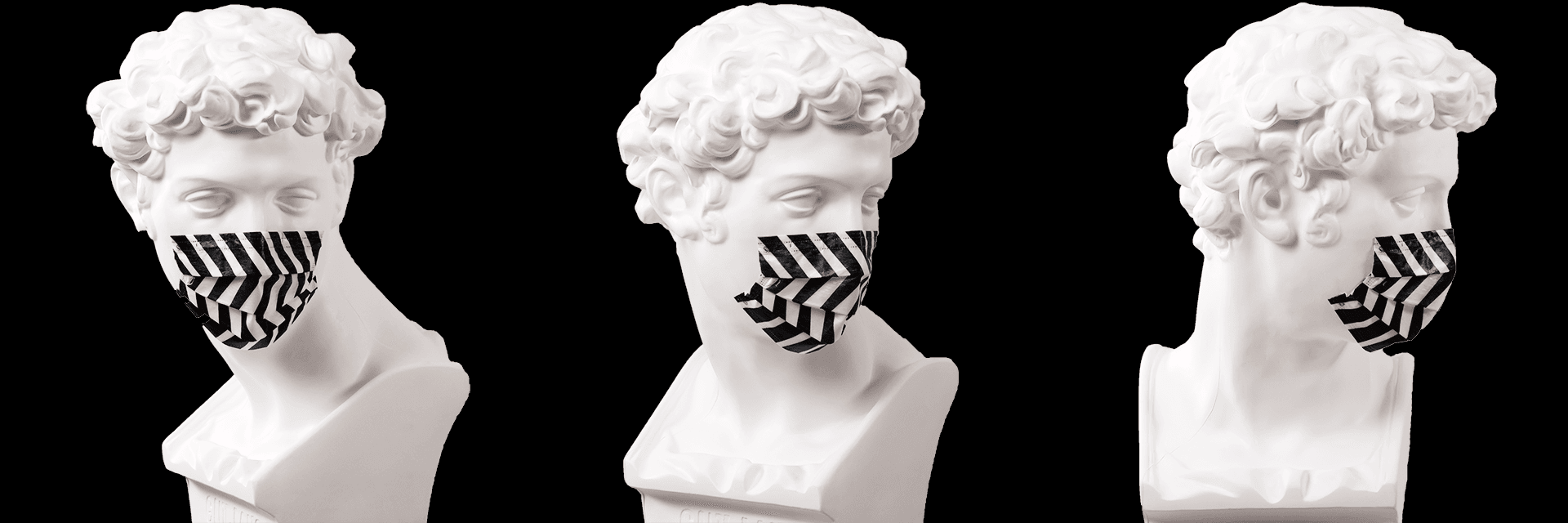
Masks come in many forms—beak-style, molded, dental, and more. Among them the dental mask is unique in that it is opened out from a folded state into use (2D → 3D), so that wearing it produces planes facing in a variety of directions, or vectors.
Taking the expression of three-dimensionality through folding as our theme, we set out to design something in which the qualities of the logo and of the dental mask would amplify each other.
1-3. Design concept: a synergy of depth, aligning the logo's folds with the mask's crease lines
The ersatz logo is flat (2D), yet it expresses volume (3D) through the folding of its lines. A mask, by contrast, is a volume (3D) formed by folding a flat sheet, but because it is a single solid color its form tends to read as simpler than it really is.
When the logo is applied to the mask as a pattern, aligning the logo's folds with the mask's crease lines promises a synergy in which both the logo and the mask appear more three-dimensional than either would on its own.
There was another concept too — Design Concept β: a design that moves between flat and solid
The ersatz logo uses folded lines to hold a volume (3D) within a flat plane (2D). If we applied this concept of crossing dimensions to the mask, we could work in reverse—projecting a flat image onto the mask, which exists as a complex solid.
Technologies Applied
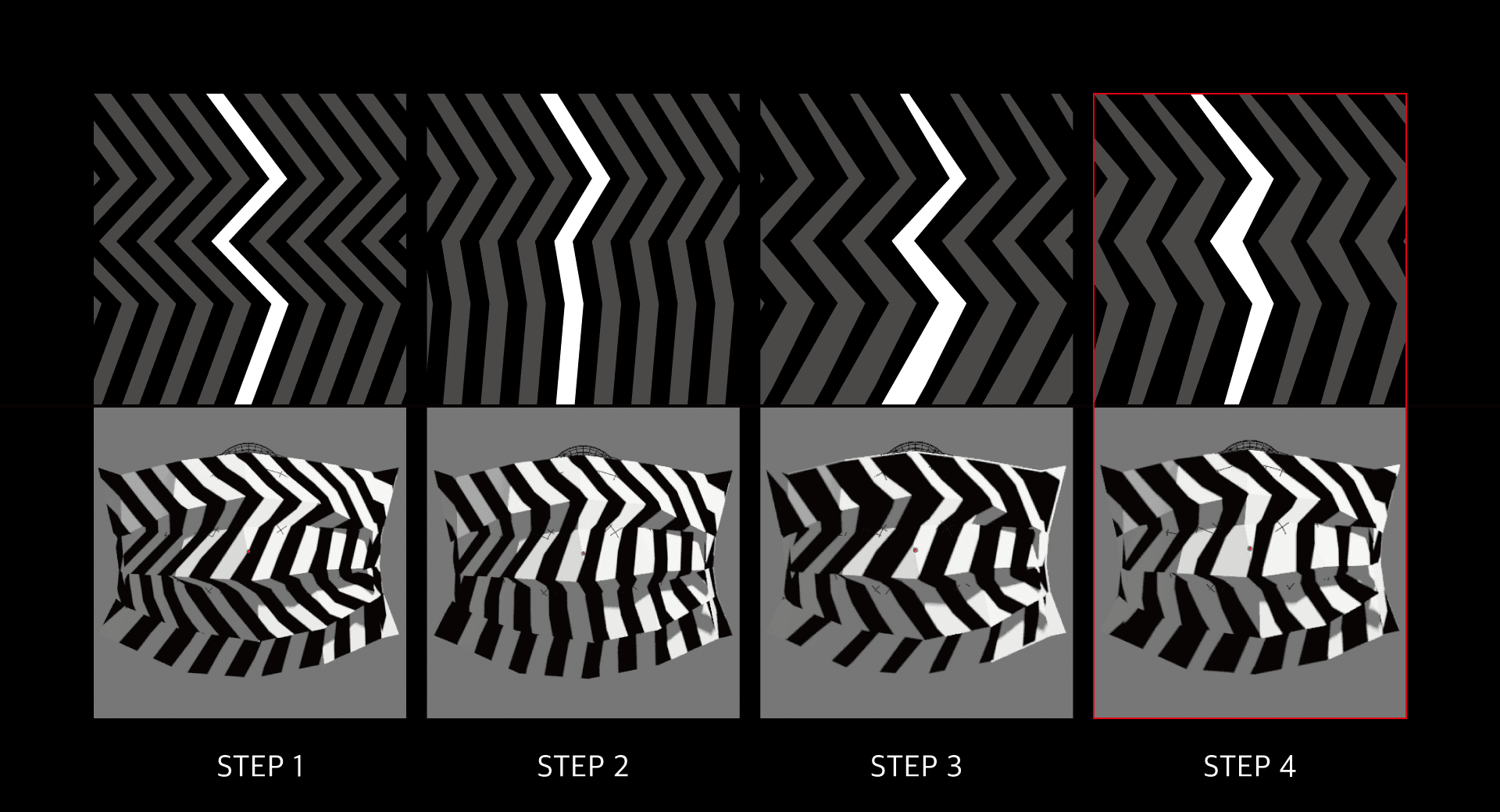
We checked our designs with paper mock-ups, made by folding printed flat patterns (nets) of the mask. Because (1) drawing each pattern by hand and (2) folding each printed net by hand consumed far more resources than expected, we looked for a way to solve it technically.
By (1) building an algorithmic design tool that generates patterns automatically from input parameters, and (2) running simulations that unfold the mask and test how it reads at a distance within a virtual space1, we cut the resources required dramatically and were able to examine a vast number of patterns with precision.
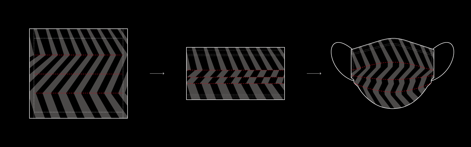
2-1. Algorithmic design tool — pattern design
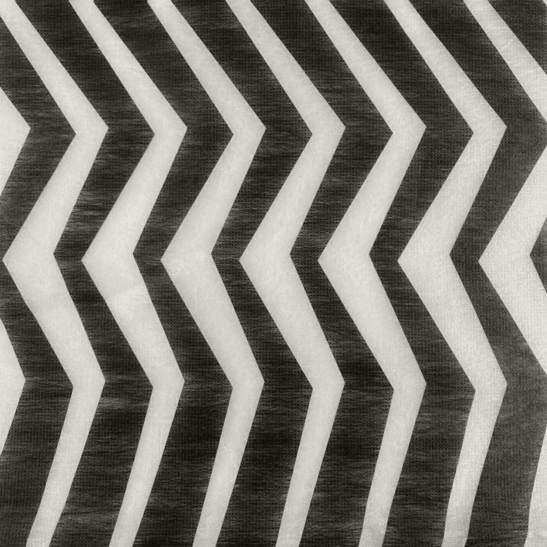
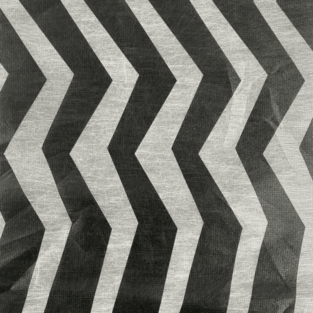
Working with a dental-mask factory in Taiwan, where a culture of mask customization has flourished, we obtained the technical drawings for the mask's net. We then built a tool in which a pattern—its folds shifting in angle along the mask's crease lines—is generated automatically once you set a base line weight, a repeat count, and the angle and weight of each tier. We reviewed designs down to increments of 0.1 mm and 0.1°.
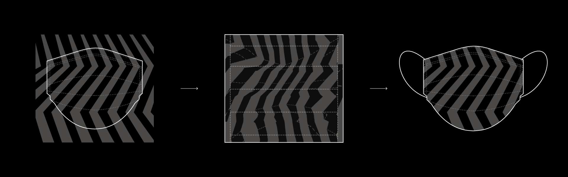
2-2. Simulation — how the mask changes shape
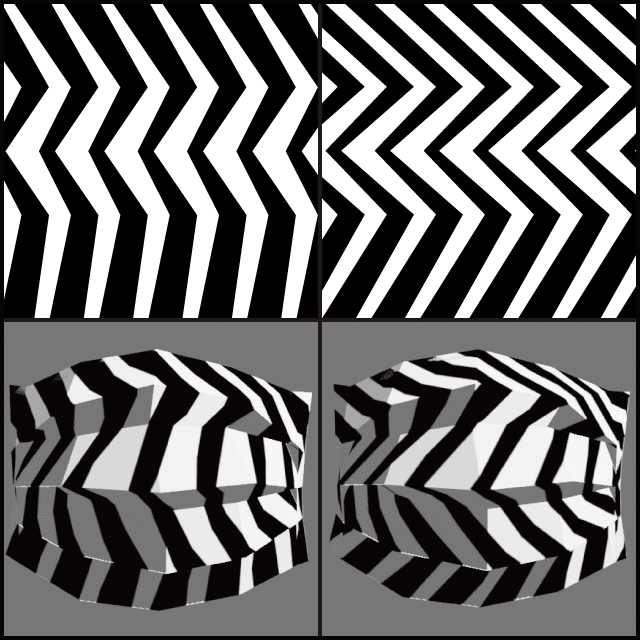
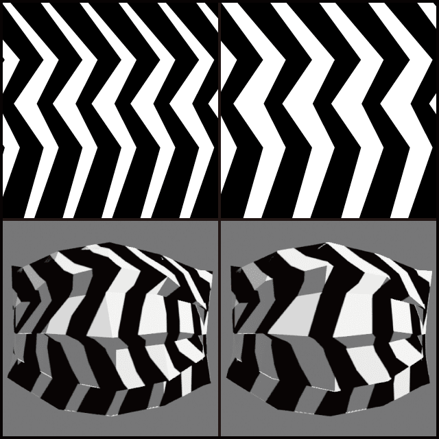
Next, we needed to streamline the mock-up process of printing a pattern and folding it by hand. So that we could judge the worn shape and the impression a pattern gives without building a physical mock-up, we modeled the mask in 3D to the dimensions of the drawings and opened it out with a physics simulation. Compared with unfolding a real mask, environmental variables introduce some error, so it is not perfectly accurate. Even so, because each pattern's unfolded appearance could be checked with nothing more than a simple texture swap, it proved an extremely effective way to review a vast number of patterns.
The Pattern Design Process
3-1. Setting the starting point
We began by applying to the mask a pattern that kept the logo's design rules as intact as possible. Preserving the line weight and angle ratios of the folds, we rotated the pattern so that the folds sit on the mask's crease lines. Because the logo folds twice while the mask has three crease lines, we added one more fold.
3-2. Tuning the input parameters
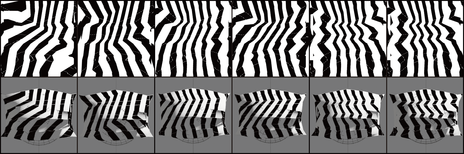
Rather than stopping at laying a logo-faithful pattern over the net, we set out to maximize the impression the mask gives once unfolded. Varying the angle, weight, and spacing of the folds, we studied how each factor affects both the sense of depth and the resemblance to the logo.
3-3. How the pattern design evolved
We reviewed a vast range of options
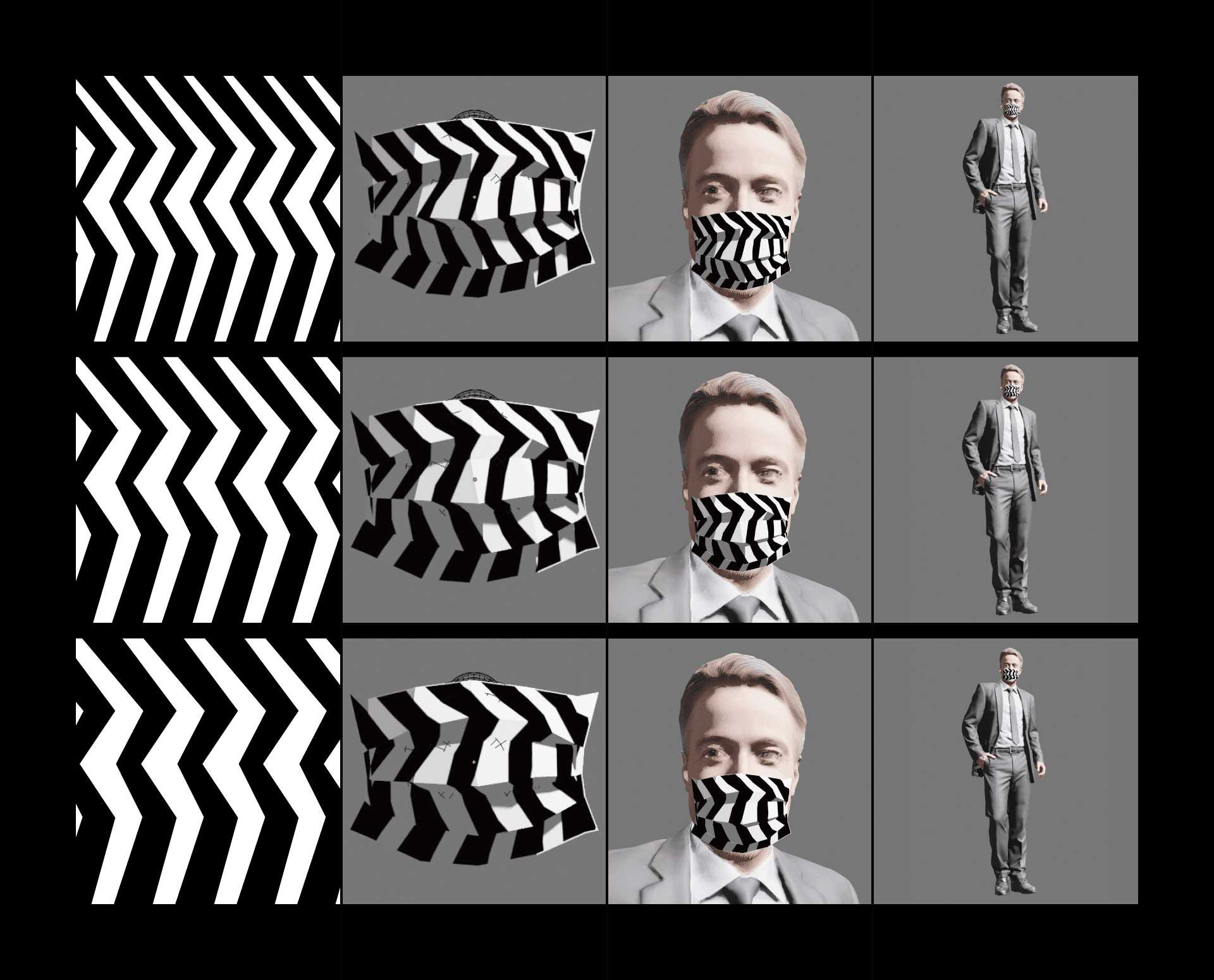
3-4. Perspective simulation
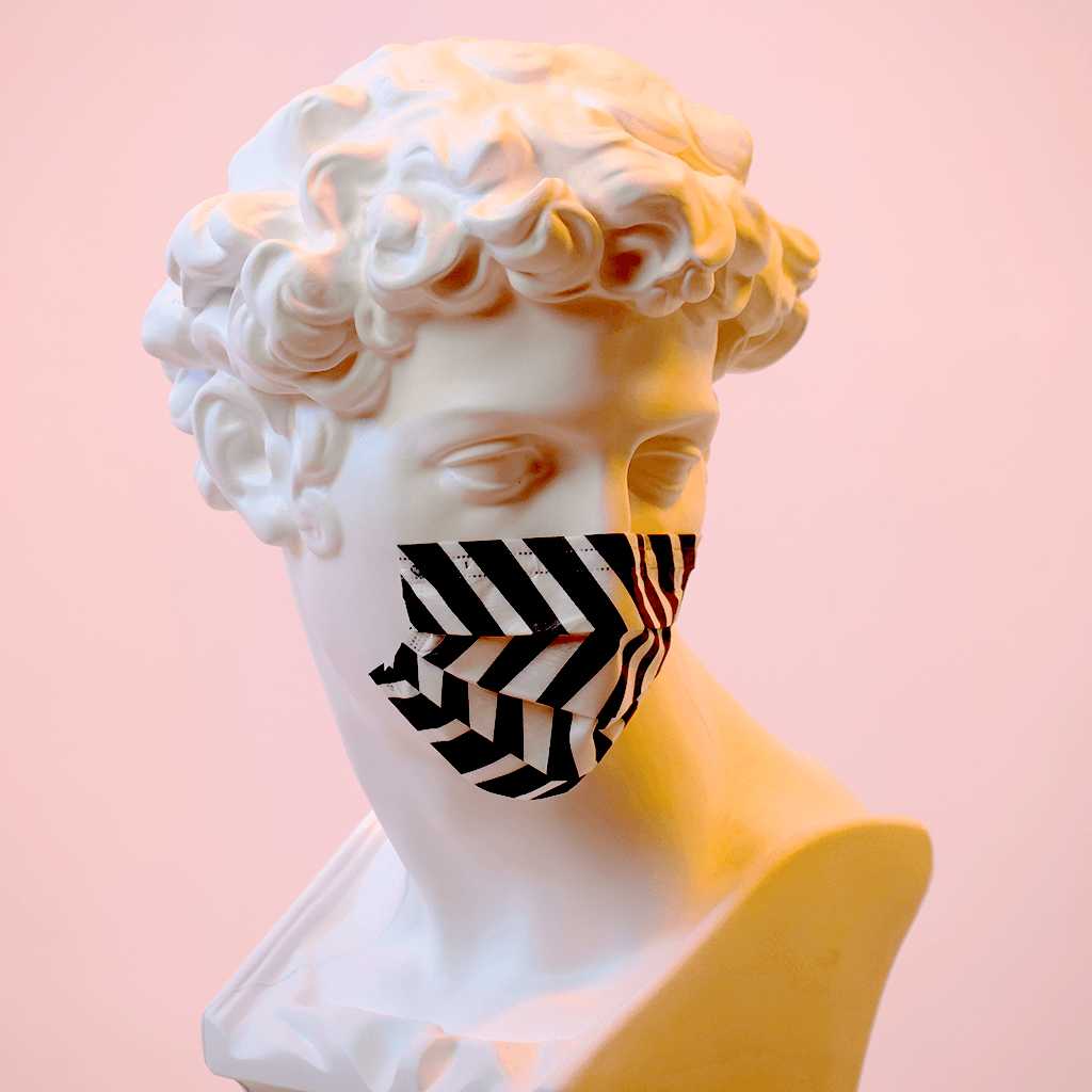
Designing the mask in a virtual space made it easy to study how its impression changes with distance. Placing the mask on a human model and varying the camera's distance, we weighed how it reads up close against how it reads from afar.
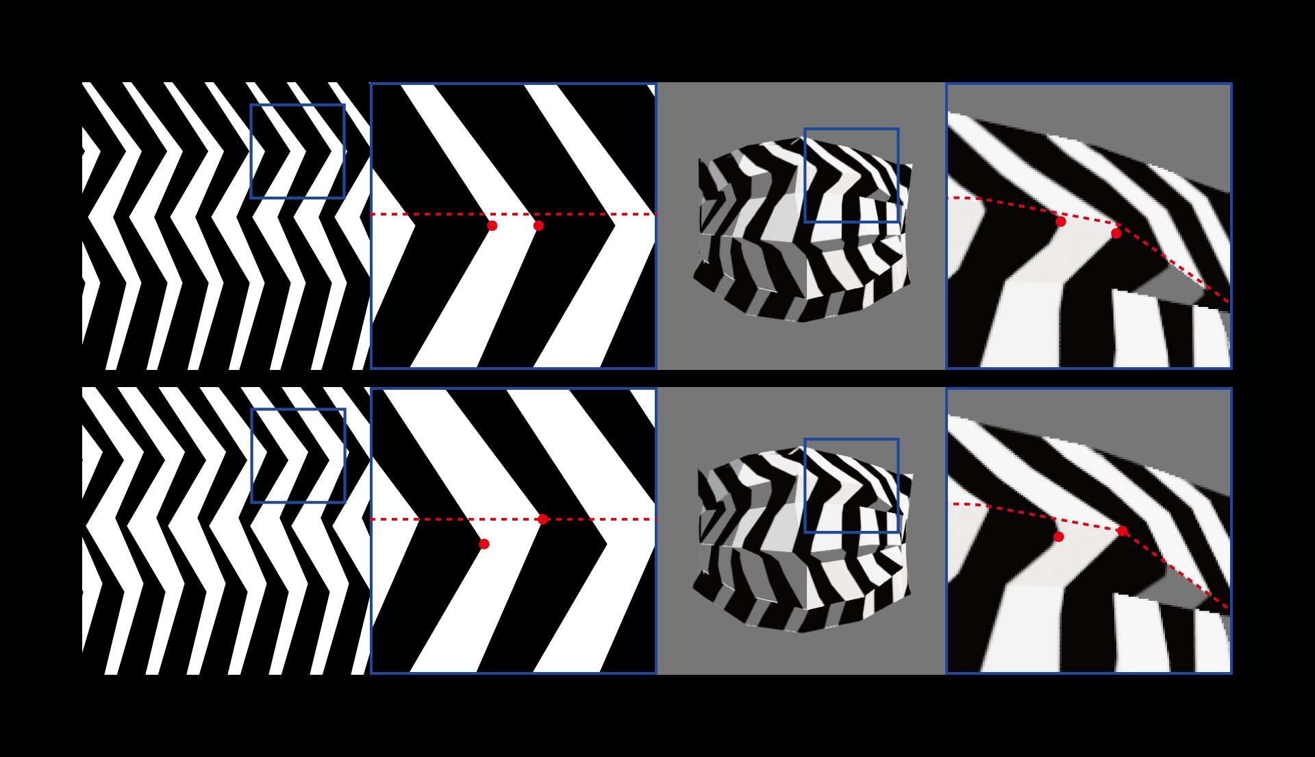
3-5. Compensating for printing error
By design, the pattern's folds should sit exactly on the mask's crease lines. In practice, however, machine vibration during printing onto the fabric introduces registration error. To absorb this, we spread the start and end points of each fold by ±1 mm, up and down, to leave a margin. That way, even when printing error occurs, as long as it stays within ±1 mm the mask's crease line still falls within the band of the pattern's fold.
Prototyping
Once the pattern design was complete, we worked through the detailed specifications with the Taiwanese mask factory we had partnered with and reviewed the prototypes.
4-1. Choosing the print color and fabric
To push the intended sense of depth as far as possible, we wanted a strong black-and-white contrast: we chose C30 K100 for the print color and white for the inner filter layer.
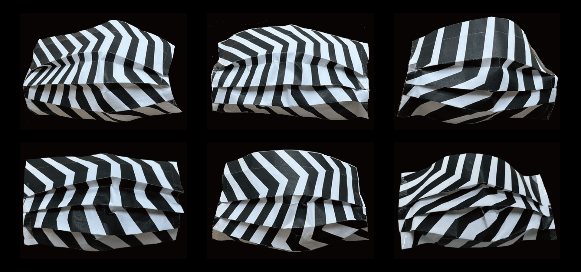
4-2. Wear test
Before committing to final production, we made prototypes of the two finalists shortlisted in the virtual space and put them through a last check by actually wearing them in the physical world.
Completed
(Written June 2022)